|
Hobart Chinese Film Festival - A hypothetical design documentLogo, Poster, and Flyer for a made-up annual Chinese film festival Created for a first-year Digital Layout class, the HCFF or annual Hobart Chinese Film Festival incorporates an unravelling mandarin into its logo, symbolising the emergences of and exposure to Chinese art and culture in Australia... |

|
Bachelor Chow - The Un-Glamour MagA lifestyle and culture magazine for single people - What to do with all that free time! Reminiscent of a utilitarian cup of noodles, Bachelor Chow was another first year Digital Layout assignment. With recipes, terrible-film reviews, creative writing, and an articles on hobby economies, Bachelor Chow doesn't take itself too seriously and hopes its readers wont either... |
|
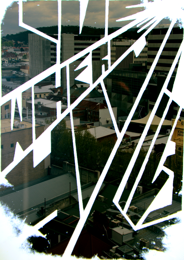
Love Where You Live - Lo-Fi poster seriesHobart is a canvas An attempt to capture the sublime, dazzling, half-light of an overcast afternoon in Hobart through the use of hand-drawn typography and double-exposure photography. |
 \
\

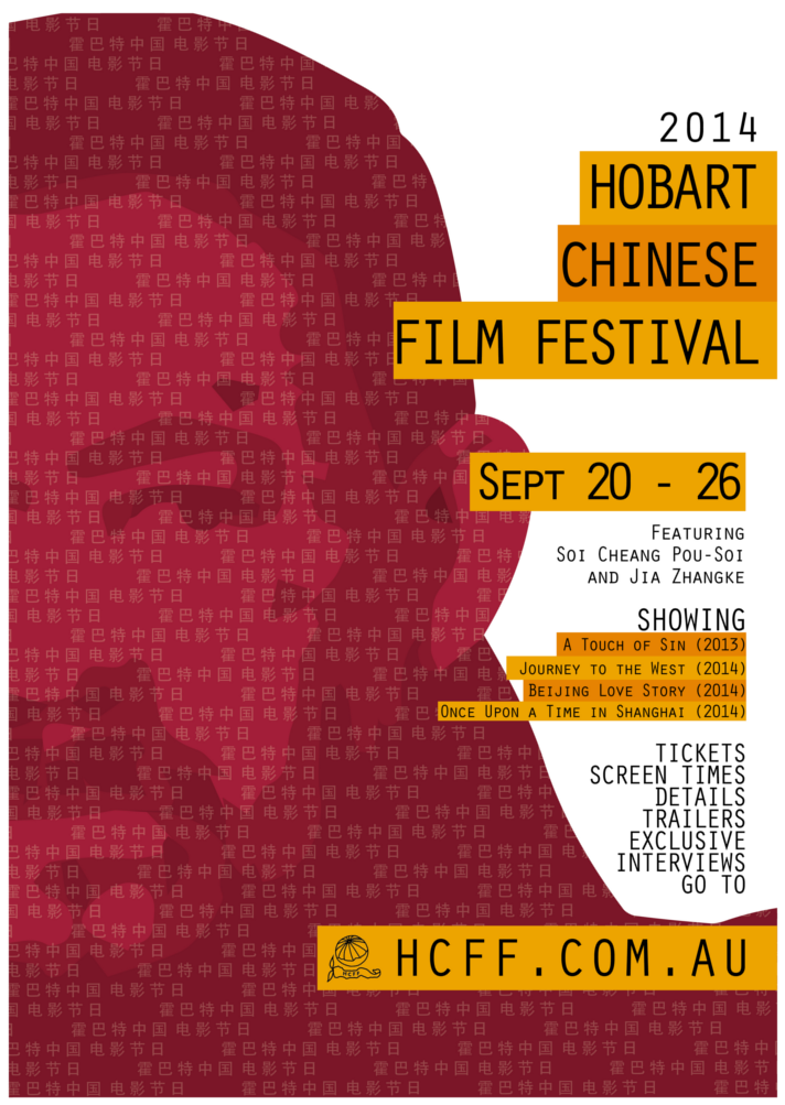
Hobart Chinese Film Festival - A hypothetical design document
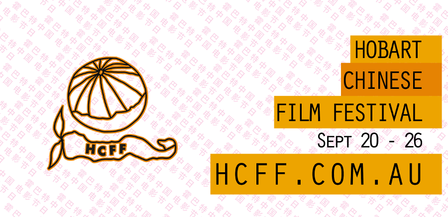
Created for a first-year Digital Layout class, the HCFF or annual Hobart Chinese Film Festival incorporates an unravelling mandarin into its logo, symbolising the emergences of and exposure to Chinese art and culture in Australia.
The poster and flyer use the image of one of the lead actors, Jiang Wu, from the flagship film of the festival, A Touch Of Sin, and would have been reinforced by posters for the actual film.
Critically, looking back, I think the design is too crowded and the colours, while eye catching and complementary, are too bold. The poster also has little informational hierarchy in the text, aside from the orange bands highlighting dates and times.
I learned a lot from this early project.
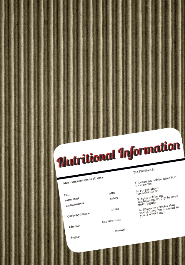
Bachelor Chow - The Un-Glamour Mag
Reminiscent of a utilitarian cup of noodles, Bachelor Chow was another first year Digital Layout assignment. With recipes, terrible-film reviews, creative writing, and an articles on hobby economies, Bachelor Chow doesn't take itself too seriously and hopes its readers won't either.
Despite the over-abundance of the Lobster font, drop shadow, and a few inconsistencies, I think Bachelor Chow more or less accomplishes what it set out to and taught me a lot about process, layout, and efficiency when working with larger projects.
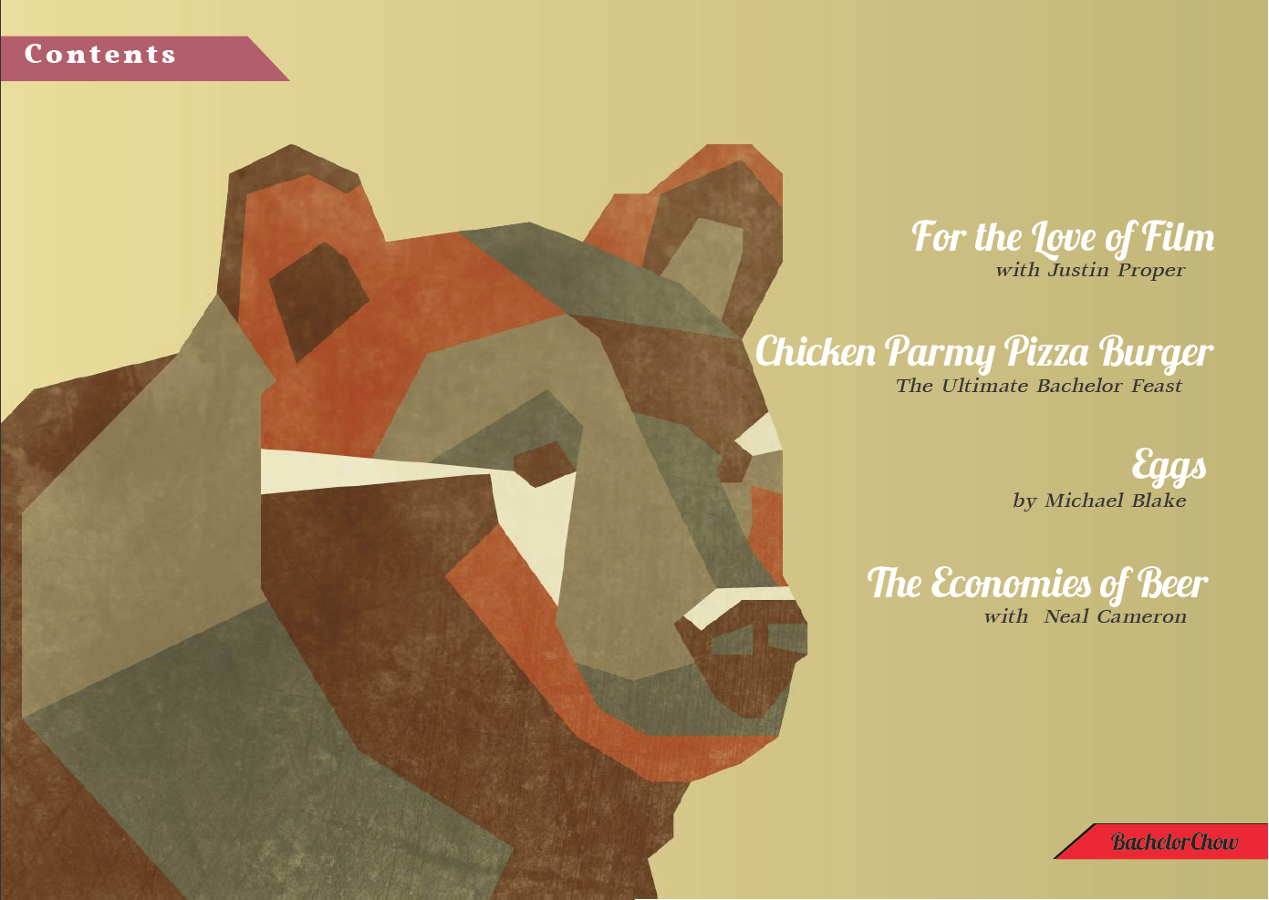
Low-Poly Bear image by Laura Crow
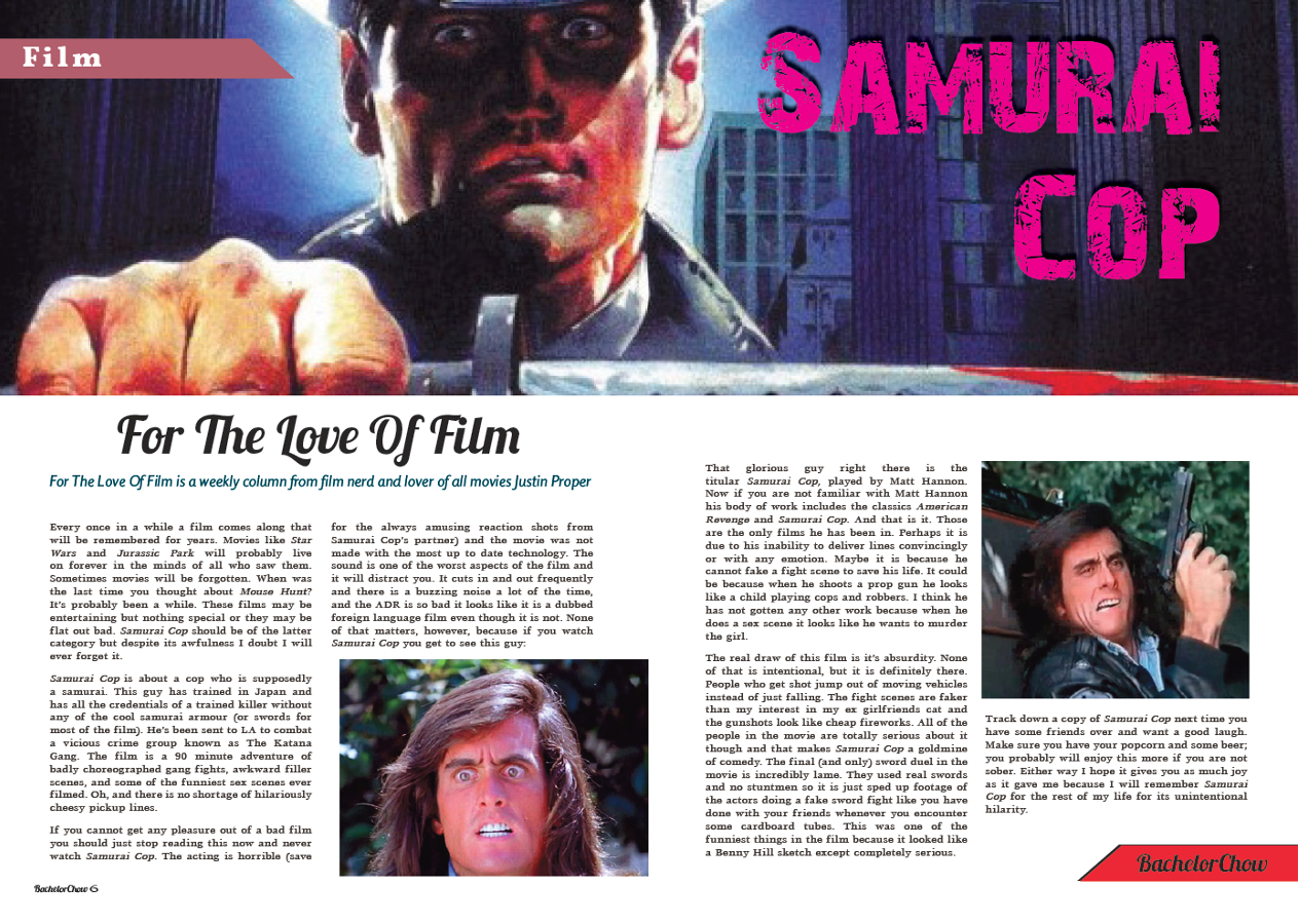
Samurai Cop Film Review by Justin Proper
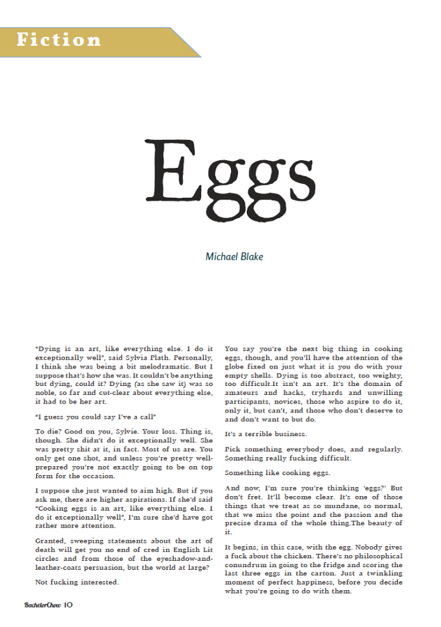
Eggs short story by Michael Blake
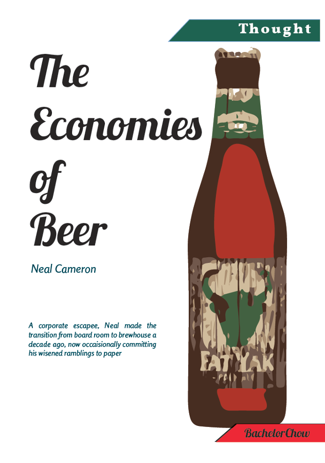
The Economies of Beer article by Neal Cameron
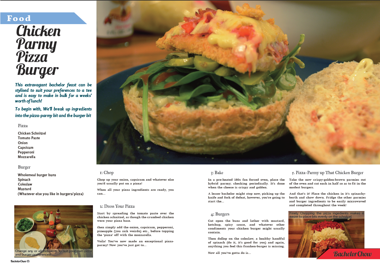
Chicken Parmy Pizza Burger recipe is unfortunately by me...
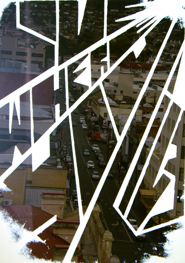
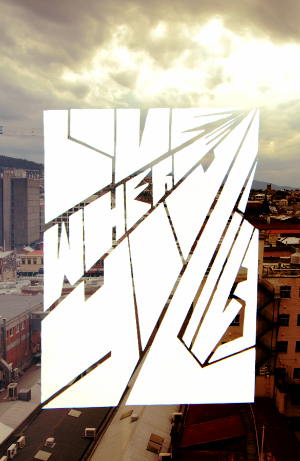
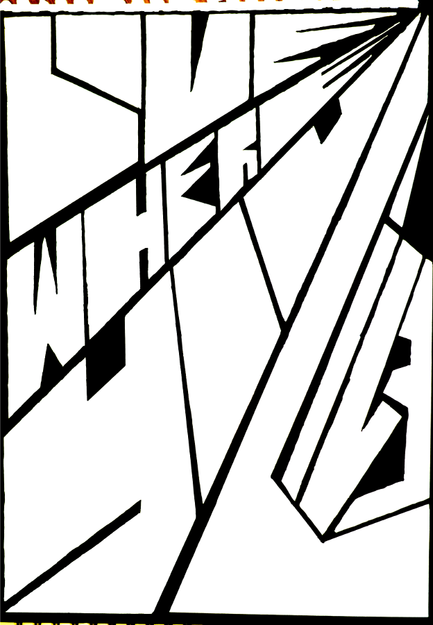
Love Where You Live - Lo-Fi poster series
An attempt to capture the sublime, dream-like, half-light of an overcast afternoon in Hobart through the use of hand-drawn typography and double-exposure photography.
Constructing a makeshift jacket-and-cardboard darkroom over a laptop screen on a carpark roof to get the first 'dark' typography-shot then struggling against my camera's 10 second double exposure memory limit to change settings and get the second 'light' image of the city, plus lots of stair climbing and conversations with security guards made this one of the most physically difficult projects I've worked on.
The washed out corners, surreal colours, and speckles of light-pollution in this series, due to the restrictions of the process, result in an uncanny feeling of forgetfulness and sleep that would be missing from a photo-shopped layer mask of the same content and I think is ultimately what saves the posters from screen-print T-shirt meaninglessness.